Skip to content
 GharSpace Presents
A Paint Guide for Homeowners
🎨 Part 1: Interior Color Planning – For GharSpace Customers
💡 Introduction: What Makes a Room Look Good?
Before spending on expensive furniture or lighting, understand how colors and materials work together. Two essential design tools are:
- Color Palette – The set of wall, ceiling, furniture, and highlight colors.
- Material Mood Board – Actual samples or images of sofa fabric, curtain shades, flooring, and laminates.
✅ Step 1: Set the Mood You Want
Think emotionally. Ask yourself: Do I want my living room to feel warm and cozy? Is my bedroom peaceful enough? Which color in your current room do you dislike? Now, write down 2–3 elements in your home you already like – e.g., “My grey sofa is good”, “I love my marble tiles”, “I want a softer wall color”.
✅ Step 2: Find Your Style (with Google or Pinterest)
Search using terms like: “Modern Living Room Yellow Wall”, “Blue Accent Wall for Drawing Room”, or “Grey Sofa Interior Style”. Pick 5 images that you truly like and save them to a folder on your phone or PC.
✅ Step 3: Apply the 60–30–10 Rule (The Golden Ratio)
Break your room color into: 60% – Main Wall & Ceiling color (Neutral or soft tones), 30% – Sofa, furniture laminates, flooring, and 10% – Accent color (Cushions, decor, a bold wall). This creates a professional balance, used by top designers.
🖌️ Step 4: Extract Your Core Palette (The Technical Part)
This is where you turn inspiration into actual, usable colors. Go to a free tool like www.canva.com/colors/color-palette-generator. Upload one of your favorite saved images. The tool will instantly extract the 4-5 main colors from the photo and give you their exact codes (e.g., #EAE2D3). These codes are your starting point. Save a screenshot of this palette.
🎨 Step 5: Apply Your Palette with the 60-30-10 Rule
Now, assign jobs to your new colors. Look at your extracted palette and apply the rule:
- 60% Main Color: Pick the lightest, most neutral color from your palette. This will be for your main walls and ceiling. It creates a spacious and airy feel.
- 30% Secondary Color: Choose a mid-tone or richer color from the palette. This is for your key furniture pieces like the sofa, cabinets, or curtains.
- 10% Accent Color: Select the boldest or brightest color. Use this sparingly for small items like cushions, vases, artwork, or a single statement chair.
When to use the Color Wheel? If your extracted palette feels limited, use Canva’s Color Wheel (www.canva.com/colors/color-wheel). Enter your favorite color code from the palette, and the tool can find a perfect complementary (opposite) color for your 10% accent, or a monochromatic (lighter/darker) shade for variety.
🪄 Step 6: Create Your Mood Board (Highly Recommended)
In Canva, open a blank template and create a collage by uploading images of your flooring, sofa photo, curtain sample, and wall color block. This becomes your personal Material Mood Board.
📋 Step 7: Final Checks Before Painting or Buying
See how your palette looks in both natural daylight and artificial light (your room’s bulbs/LEDs), as colors change drastically. Use neutral white lights (e.g., 4000K–5000K LEDs) for a luxury feel. Don’t finalize until you love it in both lights!
🎁 Shortcut Option (For Busy Homeowners)
If you don’t want to explore deeply, use a pre-made theme like White Base + Grey Accent, or Beige Base + Olive Green Decor. Or just ask us at GharSpace – we provide ready-to-use palettes with real product samples!
🏡 Summary: What You’ll Need to Finalize
- Favorite 5 photos (Google/Pinterest)
- Color codes from Canva
- Material images (sofa, curtain, flooring)
- A digital mood board to confirm your choices
🎨 Top 10 Interior Color Schemes by GharSpace
Here are our top 10 hand-picked color palettes designed to match various moods and styles. Use these to guide your selections for walls, furniture, curtains, and more.
🌄 1. Fresh & Bright
Mood: Vibrant, cheerful, youthful
Best For: Accent walls, kids’ rooms
🏞️ 2. Subdued & Professional
Mood: Calm, grounded, elegant
Best For: Offices, lounges
🧱 3. Dark & Earthy
Mood: Rustic, warm, organic
Best For: Feature walls, cafes
⛈️ 4. Crisp & Dramatic
Mood: Bold, cinematic, high contrast
Best For: TV walls, studio rooms
🌊 5. Cool Blues
Mood: Coastal, relaxing, aquatic
Best For: Bathrooms, bedrooms
🌳 6. Outdoorsy & Natural
Mood: Earthy, fresh, forest-inspired
Best For: Rustic interiors, eco-zones
💐 9. Refreshing & Pretty
Mood: Soft, feminine, floral
Best For: Boutique areas, dressing rooms
🌲 11. Fresh & Energetic
Mood: Lively, youthful, outdoorsy
Best For: Hallways, informal lounges
🐦 15. Birds & Berries
Mood: Quirky, playful, biophilic
Best For: Artistic spaces, kids’ rooms
☕ 26. Neutral & Versatile
Mood: Cozy, elegant, minimalist
Best For: Kitchens, wardrobes
💬 Want a customized palette?
We’re happy to sit with you and curate the perfect blend of colors for your dream home—matching your tiles, sofas, curtains, PVC panels, false ceilings, and more!
“Complete Interior Solutions Under One Roof”
👥 We Provide 3 Categories
Prakash
Budget-minded, looking for practical and affordable solutions.
Jethalal
A smart spender who values a balance of quality and cost.
Rajinikanth
Seeks a premium, high-end finish with the best materials.
🎨 Best Combo for Low-Maintenance Paint
✅ Result: A premium finish that’s easy to clean and lasts longer.
❌ Don’t Use Distemper Paint
It’s cheap & outdated, not suitable for modern homes. Okay only for temporary spaces: shops, rentals, storerooms.
🎨 Types of Paint (Quality & Budget)
| Paint Type | Who Should Use It | Benefits |
|---|---|---|
| 1. Emulsion (Water-Based) | Prakash | Affordable, low plastic content, basic finish |
| 2. 100% Plastic Paint | Jethalal & Prakash (Living Room) | Washable, smooth finish, more durable |
| 3. Premium Paint (Teflon/Polymer) | Rajinikanth | Ultra-smooth finish, highly washable, long life |
🧱 Example Paints by Popular Brands
| Brand | Budget | Mid-Range | Premium |
|---|---|---|---|
| Asian Paints | Tractor Emulsion | Apcolite / Royale | Royale Glitz / Royale Aspira |
| Berger | Breathe Easy | Easy Clean | Silk Glamor |
| Nerolac | Beauty Gold | Excel | Impressions HD |
💡 Paint Suggestions
Walls
Asian Royale, Apcolite, Nerolac Aura
Ceilings
Matte Emulsion
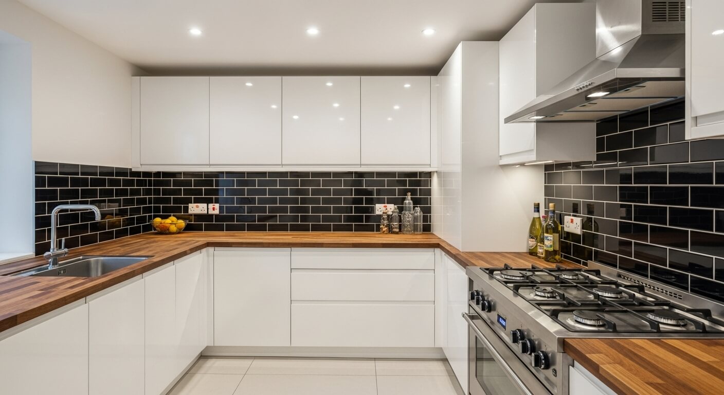
Kitchen/Bathroom
Washable, anti-fungal
🖌️ Paint Finish Types – What to Use Where?
| Finish | Best For | Notes |
|---|---|---|
| Matte | Budget homes, uneven walls | Stylish but hard to clean |
| Satin/Semi-Gloss | Most homes | Best balance of look + cleanability |
| Gloss | Feature elements only | Needs perfect surface, very shiny |
🎨 Textured Paint (Optional)
Looks amazing on feature walls but is 3x to 4x more expensive than standard paint. Recommend only for premium customers or single walls.
💸 Smart Budgeting: Where to Spend & Save
Spend More On:
- ✨POP wall finish
- 💧Quality primer & paint
- 👷Skilled sanding & finishing labor
Save On:
- 💡Fancy lights (buy after handover)
- 🎨Using too many paint shades (stick to 2-3)
📐 How Much Paint Is Needed?
Approximate Wall Area Coverage: 120–160 sq.ft. per litre
| Home Type | Approx. Quantity |
|---|---|
| 2BHK – Prakash | 28–30 litres |
| 2BHK – Jethalal | 32–35 litres |
| 2BHK – Rajinikanth | 38–42 litres |
🧪 Exact quantity depends on number of coats and surface condition.
⚠️ Base Coat Matching is CRUCIAL
Match primer and putty with the paint type (e.g., Use plastic/acrylic putty with plastic paint). Never let workers choose random materials—decide paint first, then ask for compatible primer and putty.
Mismatch = warranty void + poor finish + more cost later.
⚠️ What NOT to Do
- ❌Don’t let painters paint over switch plates — it spoils their look.
- ❌Don’t paint the final coat before installing AC, lights, or sockets.
- ❌Don’t skip primer — it protects your walls and your paint investment.
🛡️ Final Tips for Customers
✅ Use washable paints in high-traffic areas (dining, kitchen, kids’ room).
✅ Always test a small patch before finalizing full wall color.
✅ Leave a 4–5 day gap before the second coat after installations.
✅ Store extra paint with the date & shade code written on the can.
✅ Ask for a final cleaning and handover checklist.
✅ GharSpace will arrange the warranty cards from the painter/vendor for premium paints (3–5 year protection).